
How Has Social Distancing Affected Colorado?
This article is part of an ongoing collaboration between the Colorado School of Public Health, the Denver Museum of Nature & Science, and the Institute for Science & Policy. Click here to watch the full recording of this session and find all of our previous COVID-19 webinars and recaps here.
In the past few months, social distancing has become part of life in Colorado. Recently, scientists have been able to use mobile device data to study some of the ways social distancing has changed travel within the state. A team and I authored a report last month entitled “Colorado Mobility Patterns During the COVID-19 Response” and we’re going to look at some of those findings here. I’ll cover how we’re able to study geographic and demographic patterns in the aggregate using cell phone data, as well as address some of the privacy concerns and future implications of this research.
COVID-19 spreads primarily through droplet transmission. These droplets can travel three to six feet and either be inhaled directly by other people or land on surfaces and be transmitted through touching and other shared contacts. The country quickly moved to the idea of social distancing to reduce the instances where people transmit the virus through close proximity. Avoiding handshaking, keeping your distance, working remotely, avoiding crowds, staying home ─ that all comes from the literature on droplet transmission. The key takeaway is that viruses spread exponentially, and social distancing can break some of those linkages.
So let's start with a timeline of COVID-19 in Colorado. On March 5, we had our first case reported in the state. On March 10, Governor Polis declared a state of emergency, and things moved quickly from there. As of March 16th, we saw restaurant closures. On March 23, school closures were announced, and that actually came a bit after spring break where most university students had gone home. And then on March 26, we had the stay at home order, which was the strictest policy put in place. And over the course of that timeline, the curve really started to flatten out. So there's certainly evidence that the measures put in place had some effect on disease transmission.
People’s travel habits changed over that period of time, but how can we study those patterns in even greater detail? We start with the idea that mobile device data is everywhere. A few companies have become famous or infamous over the last couple months for collecting information from mobile devices to try to understand mobility and the impact of social distancing.
We're going to focus primarily on SafeGraph, which recognized early on that partnering with academic institutions to parse the data is incredibly helpful for investigating questions we're all interested in. They’re able to share anonymized and aggregated data with us (more on that in a moment) about how long devices are spending at home, how far they're going, when they do go out and travel, and other things like that. They can also track visits to points of interest and count devices that move in and out of these spaces.
It’s incredibly important to address the privacy concerns with this type of research. SafeGraph ensures that by the time mobile phone data comes into my hands, it's already been aggregated at some level, either in what's called a census block group (about 1,500 anonymous people lumped together as a bloc) or just the number of devices that are at a given location or spend any time in that location. So I never observe any individual’s phone or track movement between locations or anything like that.
When you permit location services on your mobile device, you're permitting these apps to collect information, but users have the ability to opt-out of this data collection. By now, all of our phones have pretty sophisticated options for doing this. Moreover, you can also visit the company's website and, in a lot of cases, simply opt-out there. As academic researchers, we have a data use agreement that permits us to use the data strictly for COVID-19 related purposes.
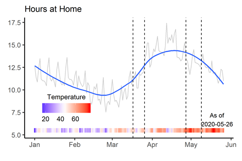 Let’s look at some of the metrics. This graph represents the time spent at home in Colorado since January 1, and the blue line gives you a sense of the overall trend. In early January, you can see more normal patterns; we're generally home for holidays and slowly venturing out more into March. But then the first case in Colorado was on March 5, so we start to see behavior change to reflect school closures and then the stay at home order. We can see that these policies clearly had an effect on mobility, with more people staying home for more hours each day. But since about mid-April, with the relaxation of the stay at home order, this mobility pattern is changing, and people are getting back to their pre-COVID time away from home. That’s not necessarily a problem, and I’ll cover that a bit more later.
I should note that these are broad-scale mobility patterns. We're able to measure when and where people are coming into contact, but not the nature of those contacts, not if they're maintaining six feet of distance, not if they're wearing masks, not if they're washing hands and wiping surfaces and so on. All of those things can have an influence on transmission.
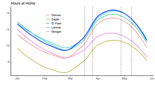 When we look at county-level data, we see some regional variation. In Eagle County, we see the same pattern as Denver, but at lower levels. We're exploring the difference in the data quality in urban and rural areas. But then we also see counties like Morgan County that started with patterns very similar to Denver and then have seen less of a change.
This might not necessarily be a bad thing. I'm not trying to rate or score any of these individual counties; the risk may have been lower in certain places, so we might expect less behavioral change. I want to be very clear here and remind everyone that that again, we do not observe individuals.
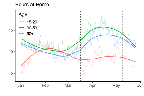 We can also try to tease out patterns from age groups by classifying Census block groups based on the age structure of the population. We classify Census block groups as an age group if over 70% of the population is represented by that age group. The patterns suggest that 15-to-29 year olds responded less to stay-at-home guidance than the other groups.
We can also break it down by income, and that data suggests that higher-income households are able to respond more, largely driven by working at home. We see a lot more ability to work at home or at least have a flexible workplace in higher-income professions.
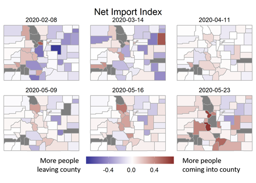 A lot of us live in this state because we enjoy the natural beauty and amenities and outdoor recreation opportunities. But movement between counties can actually promote transmission. This graphic is what we’re calling the net import index. If the county is blue, then more people leave that county than came in, and red is vice versa. On April 11, when we were right in the middle of the stay at home order, mobility between counties really slowed down. And we can see that that's starting to pick back up. On Memorial Day weekend, we can see that there's a lot of movement.
We see visitation to certain non-metro counties increasing, and that's potentially concerning because it suggests that even if those counties have low case counts right now, there may be people visiting who are infected. And they may not even know it; they may be asymptomatic carriers able to transmit even if they aren’t necessarily feeling bad themselves.
Restaurant visits are another key metric we're keeping an eye on as they begin to open across the state. Restaurants provide a nice venue for socializing but, unfortunately, can also lead to transmission. The data shows visits falling off pretty dramatically as of March, especially in counties like Eagle, where a lot of the business was probably from outside of the county, but now that’s starting to pick up as takeout orders became more popular.
Statewide, we see new COVID-19 cases fall, which is a good thing, but that didn't occur without cost. And so I want to highlight small business employee earnings over time. We find that those have fallen pretty dramatically along with businesses suspending operations. It’s starting to rebound a little bit, but we're still 31% below where we were before COVID-19. We can also look at consumer spending, which is 19% below the pre-COVID average, with some significant variation across counties.
A few limitations to note here: the data is on a delay and could still be noisy. Mobility device data and our sample represents about five to 10 percent of the population, so it's by no means a census. We're not able to observe everybody. All of these estimates have uncertainty built into them. And while mobility is rising ─ a precondition for transmission ─ that doesn’t by itself account for whether people are wearing masks or engaging in other protective measures.
Mobility device data is now available to help inform policy. It's an incredibly useful new tool. But we're still learning a lot. The pandemic is far from over, so we need to continue to exercise caution and in the form of staying at home, reducing close contact, wearing masks, and being attentive to the public health recommendations.
Lightning Round: Questions from Viewers
Wait, my mobile phone data is just out there being recorded and used for studies? Did I agree to this?
It’s my understanding that companies like SafeGraph are able to collect information from applications that ask to use your location services, per the terms and conditions. Users may turn off location services globally at any time or choose to deny the use of location services to individual apps.
I’ve heard that something like 9 out of 10 COVID-19 deaths are in the 60-and-over age group. Do you have more insight into why that would be the case if it’s the younger age groups who have been more mobile?
That's a good observation based on what those lines suggest. I will say that from a statistical estimation standpoint and the margin of error in our sample, it could be that the curves aren’t all that different from each other. So I don't think we can rule out that older groups are more mobile than we’re seeing. In addition, the case fatality rate in older populations is higher, and there have been several documented outbreaks at nursing home facilities.
Are there normal seasonal trends in mobility that we could compare these patterns to?
I'm actually very excited because SafeGraph just released these metrics going back to January 2019. So we now have a year of historical data that we can compare to. I wasn't able to integrate it here because it’s come out so recently, but in the next version of this report, we're going to contrast the seasonal patterns from last year with what we're seeing this year.
Was there anything that surprised you about this data?
I guess it would just be the shift that happened very quickly as the pandemic really started to affect life in the United States. In Colorado, we see pretty clearly that people changed their behavior dramatically. The reports of near-empty streets and things like that were largely accurate and bear out in the metrics. As people prepared for the stay at home policies, we saw visitation increased to Costco and grocery stores. And I thought that was really interesting because it picked up on this human tendency to prepare and plan. But unfortunately, from the public health perspective, we ended up steering a lot of people to the same places all at once.
What do the data show for rural areas compared to urban areas, specifically farmland?
Our point-of-interest visitation data is fairly sparse and certainly wouldn't cover farming areas adequately. It's going to cover places of business where people are frequently going. The sample representation is lower in these rural areas, just because of population density. There aren't as many mobile devices there. So I put less confidence in the data in those areas. I’ll add that in general, your risk of contracting or spreading the virus is going to be low if you’re working outside on a farm, operating machinery by yourself, or other things like that compared to going to busy retail shops.
How does mobility information tie in with epidemiological modeling?
All of these pieces fit together and are going to be helpful for informing policy decisions now and in the future. I’m part of the state’s modeling team and one urgent question right now is whether or not mobility data may be a good leading indicator for transmission. At the moment we can really only study about two weeks prior, because we calibrate the model to hospitalization data and that’s tricky because you have an viral incubation period of about five days and then people don’t end up in the hospital until days after that, if at all.
Do masks create a false sense of security and increase willingness to socialize?
We actually have a paper which studies that very question and there's this idea in economics and public health literature called risk compensation. It suggests that if we're able to mitigate some risk, then we may engage in other riskier behaviors. A common example is seatbelt use, where people end up driving faster after seatbelt laws are implemented. Another is condom use and sexual activity relative to HIV transmission. It’s possible that when we and others are wearing masks, we maybe feel that it's safer to go outside or to engage. We're not exactly sure about the net effect of masks on COVID-19 transmission yet. But it does seem that when mask orders were put in place, people did end up spending more time outside or visiting certain locations away from their home.
Are these kind of mobility studies underway in other states as well?
Yes, there are many other efforts like mine, and SafeGraph and these other companies are producing metrics for the entire United States. They're making that information available to everybody. It’s useful for comparisons and helps us isolate the effect of different policies in different places. There's a lot of discussion about how the data could and should be used and where the pitfalls are. It's a really active, engaged community. Everybody's trying to inform people. We recognize that there are significant human costs to some of these policies like stay-at-home and if we can use this data to understand how quickly we can relax that guidance and get back to our normal interactions, then that's a good thing for everybody.


Assistant Professor of Agricultural & Resource Economics at Colorado State University
Disclosure statement:
The Institute for Science & Policy is committed to publishing diverse perspectives in order to advance civil discourse and productive dialogue. Views expressed by contributors do not necessarily reflect those of the Institute, the Denver Museum of Nature & Science, or its affiliates.